Learning design
Why the game is a wilderness trail
A dashboard tells a kid nothing. A trail tells them where they are, how far they have come, and what the next stop is — without an adult translating any of it.
The theme came before the curriculum. I wanted a K–8 math game where a seven-year-old could open the app and know what to do next without asking anyone. That is a harder design constraint than it sounds, and it is the reason the whole thing is a hike instead of a dashboard.
On a map, a kid can see three things instantly: where they are standing, how long the trail is, and which marker comes next. Progress bars and stat cards cannot do that. They tell an adult how a learner is doing, and they tell a learner almost nothing about what to do with their hands.
What a grade looks like as a trail
A grade is one stretch of trail. A unit is a marked section of it, opening with a sign that names the section and closing with a checkpoint. A lesson is a stop: the learner walks in, gets taught something, checks that they are ready, and practices it.
The map keeps one shared left edge and a single vertical spine, the way a printed trail register runs down a page. Every stop is a marker post with its own state — walked, next, further up the trail. The next stop is the only one painted with the action color, and there is exactly one of those per screen.
Above the trail sits the "You are here" band: a full-width painted sign carrying one action and the name of the next lesson. That is the whole navigation model. Open the app, read the sign, walk the next stop.
What a kid can read without help
- Which stop is next, marked with the one action color on the screen.
- How far along the trail they are, written as a sentence rather than a row of statistics.
- Which sections are closed, printed as closed rather than hidden.
- Whether the work ahead is easy or hard, marked with the same circle, square, and diamond a real trail uses.
Borrowed from the park service, honestly
The visual language is a national-park brochure, printed flat: hard rules, near-square corners, no shadows, no fake wood grain, no paper texture pretending to be a material the screen cannot produce. Flat ink reads as printed matter, and printed matter is legible at a glance, which is the entire point.
Three borrowed shapes do real work:
- The route shield. A numbered square with a pointed foot, exactly how a trail map numbers its routes. It is how a stop is identified, so "the third stop in this section" has a picture instead of an explanation.
- The painted blaze. A rectangle of paint on a tree is how a real trail tells a hiker which way to go. In the app, that color means "this way" and nothing else — no decoration, no branding, no second competing accent.
- Difficulty marks. A circle, a square, and a rotated diamond, read straight off park signage. A five-year-old can tell which stop is easy before they can read the word for it.
Each grade walks a named wilderness range — canyon country at the start, alpine ridge and dusk summit much later — and the range's color flows through that grade's shields. Color says where you are before it says anything else, which is useful when a learner switches between two grades.
Closed is a fact about the trail, not a verdict on your kid
There are two reasons a stop can be unavailable, and they are drawn with completely different vocabulary on purpose.
A stop that has not been reached yet dims its fill and keeps its words fully readable, because a learner still has to be able to read what is coming. A section that is not open yet — the part that asks a grown-up — stays at full strength and takes a red closure notice, exactly like a closed section of trail: a red shield, a SECTION CLOSED chip, and a notice that says the trail is closed beyond this point.
Neither one is an error. Nothing in this system turns red because a learner got a question wrong. Red is a status of the world, never a judgment of the person walking through it. The consequence is small but it matters: a kid who sees red learns to read it as "that part of the map is not open yet," not as "I did something wrong."
The animals are not decoration
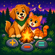
A companion walks the whole trail with a learner — chosen in the first minute, present in teaching, practice, and every small celebration. It stays the same animal for the whole journey, which is why it earns the loyalty a kid gives it.
Rue, a raccoon, hands out a real trail fact at the head of each unit. Learning guides, one animal per mathematical domain, preview a unit and offer a specific piece of encouragement tied to the concept rather than generic praise. A guide never replaces the learner's own companion — the buddy walks with you, the guide just knows the country.
What the theme is not
This is a math game with a hiking theme, not a hiking game with math in it. No lesson asks a learner to manage a backpack or navigate terrain. The wilderness is doing one job: making the structure of a nine-year course visible to someone who is seven.
That is the test I would hold any kids' app to, including this one. A theme earns its place when it makes the next action obvious, the goal legible, and the state of the journey honest. When it only makes the logo cuter, it is decoration with extra steps.